
Janssen Compass
Janssen Compass is a support program for patients starting cancer treatment.
As the lead brand designer, I guided the brand from concept to completion. My team and I delivered an accelerated pilot in 6 months and evolved and expanded the brand to 6+ Janssen therapies.
Because of program support, patients reported an increase in treatment preparation from 50% to 95%, with 100% enrolling in the program after introduction.
Images used with permission | © Johnson & Johnson
Year
2021–23
Skills
Branding, identity guidelines, art direction, print, environmental
Awards
2021 J&J Design Impact Awards | Runner-up
Contributing team
Philippe Intraligi, Don Zinzell, Emily Franklin, Mary Beth Lumley, Yasmine Abuzeid

I participated in patient interviews to understand their needs and experiences. Every piece of collateral addresses a need that my team and I heard directly.
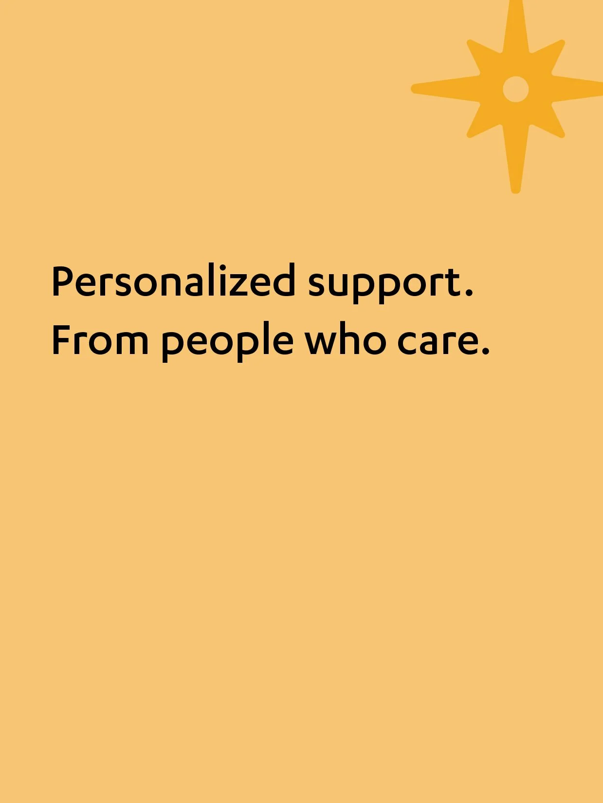
I collaborated with strategists to create a brand concept: "Walk in your shoes", which communicates wellness and support. The brand is visualized through warm, inviting colors, high contrasting type, and authentic photography.

Janssen Compass is an initiative under Janssen Pharmaceuticals, so the 2 brands needed to live harmoniously. Elements of Janssen were brought through Janssen Compass, such as the logo structure, typeface, and select colors.
Janssen Compass differentiates by expressing warmth and approachability with higher proportions of warm colors and negative space, while friendly illustrations give a human touch.

Wellbeing focused welcome kit
After enrolling in the program, patients receive a welcome kit in the mail.
I collaborated with strategists to design welcome kit items grounded in motivation strategies. Items encouraged reflection and goal setting and provided delight as patients began cancer treatments.


Core welcome kit items
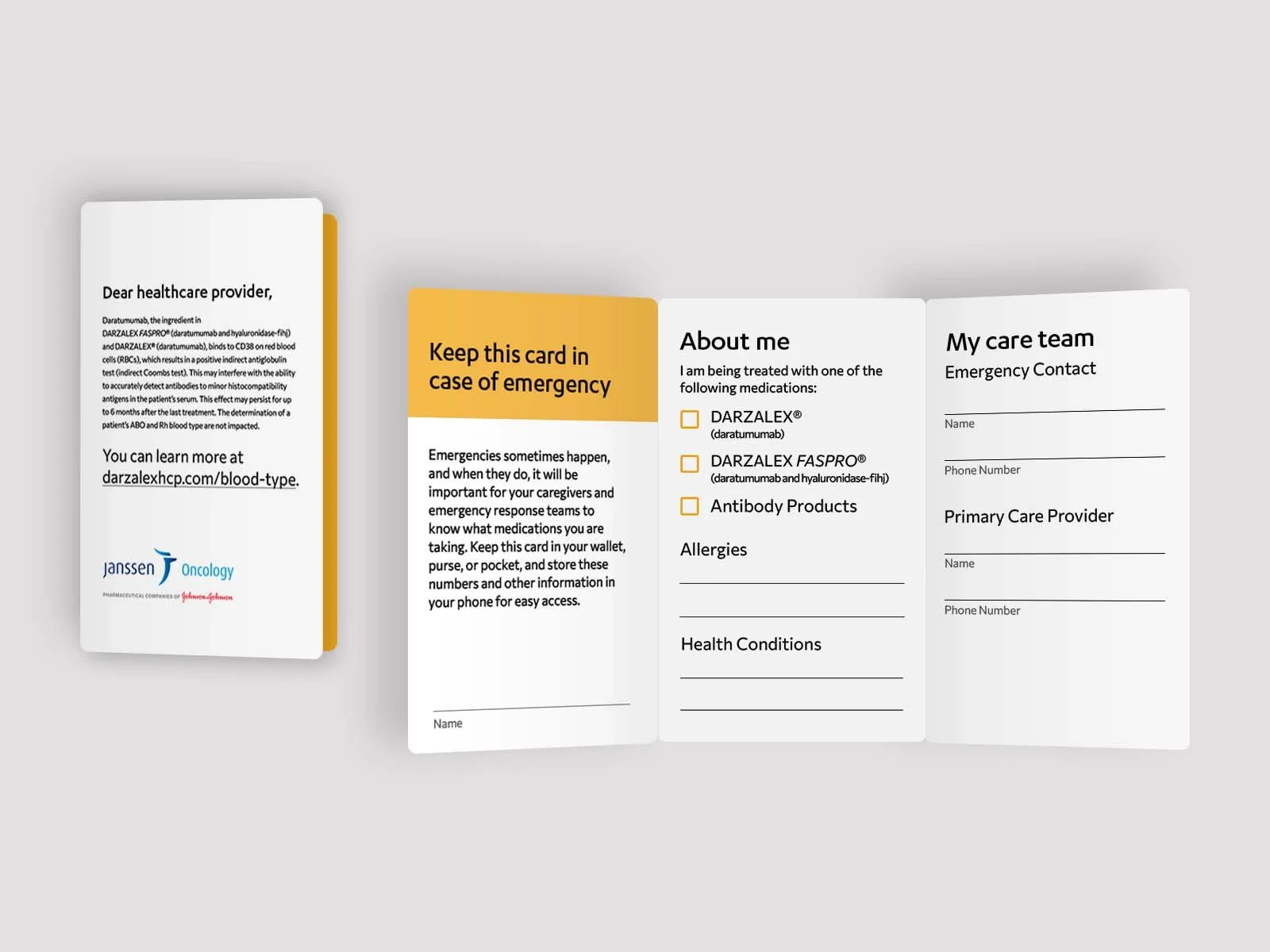
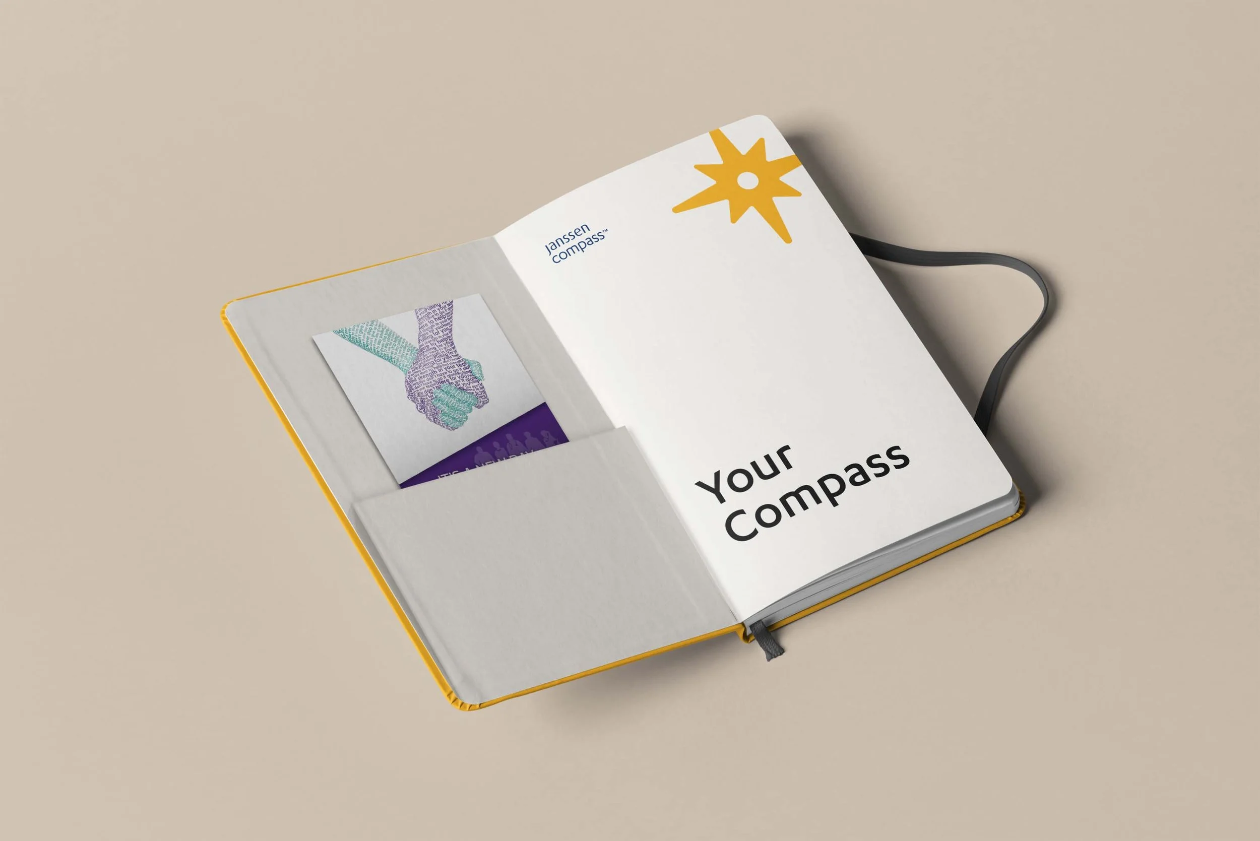
Your Compass guidebook
Includes program info, weekly planner, goal writing prompts, and stress-reducing coloring pages
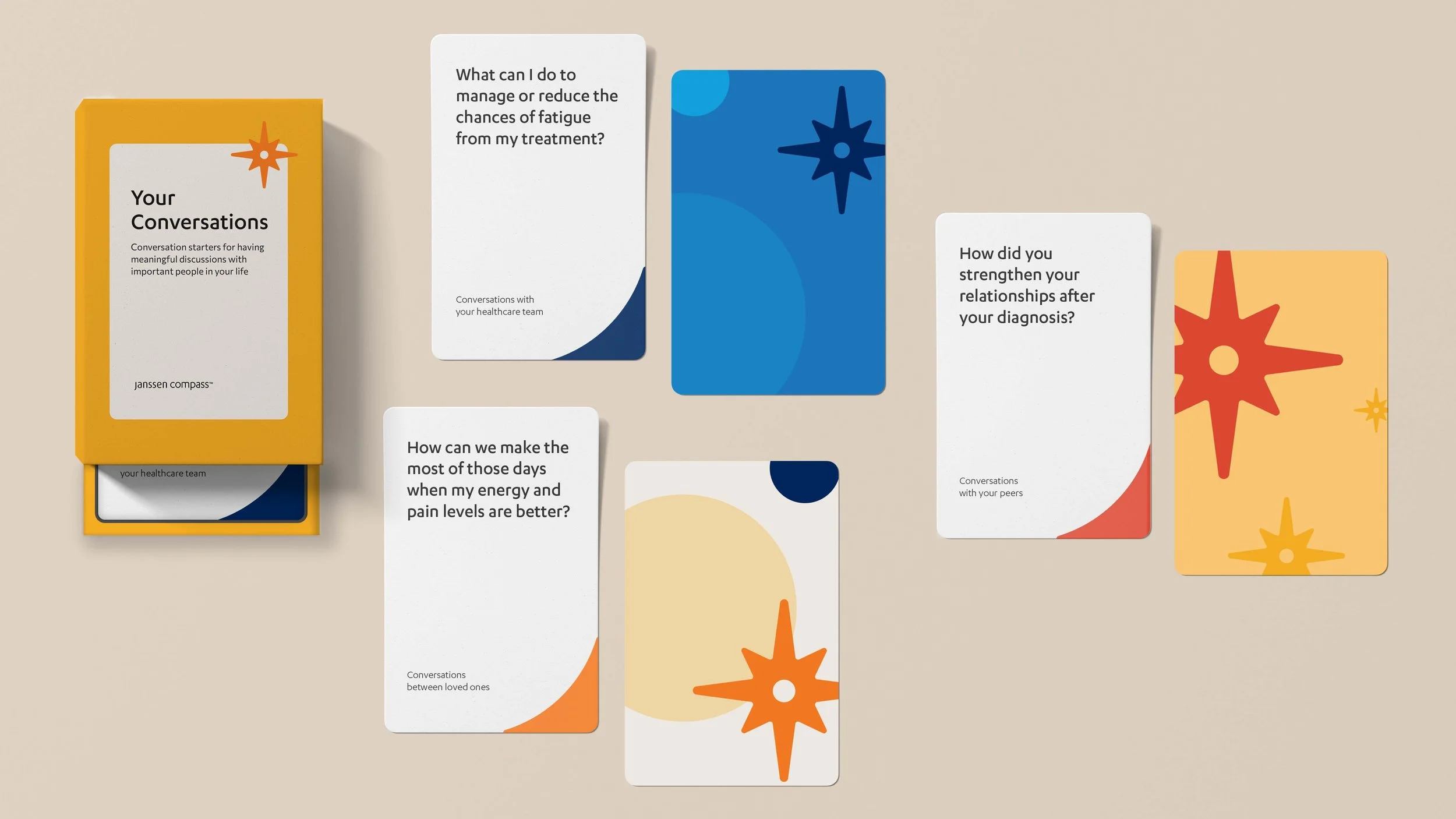
Conversation cards
Help to initiate meaningful conversations
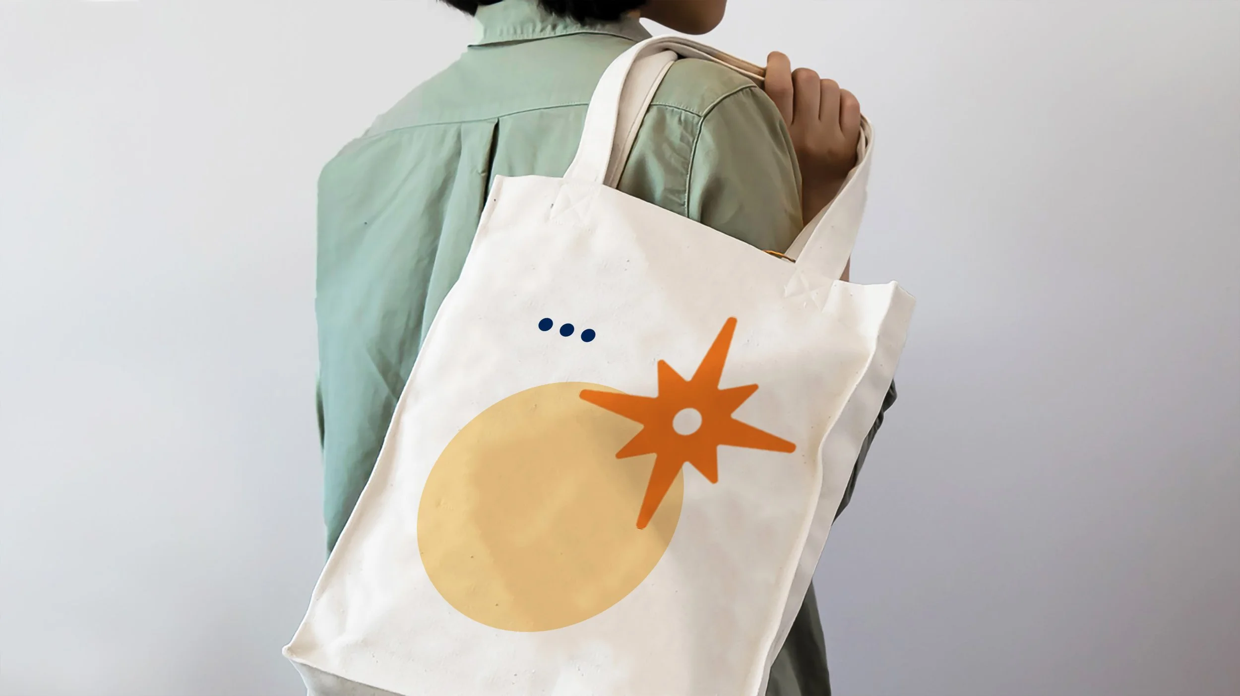
Tote bag
Houses welcome kit items and can be used to carry items between appointments
Blood type card
Wallet-sized card for medical teams in case of emergency


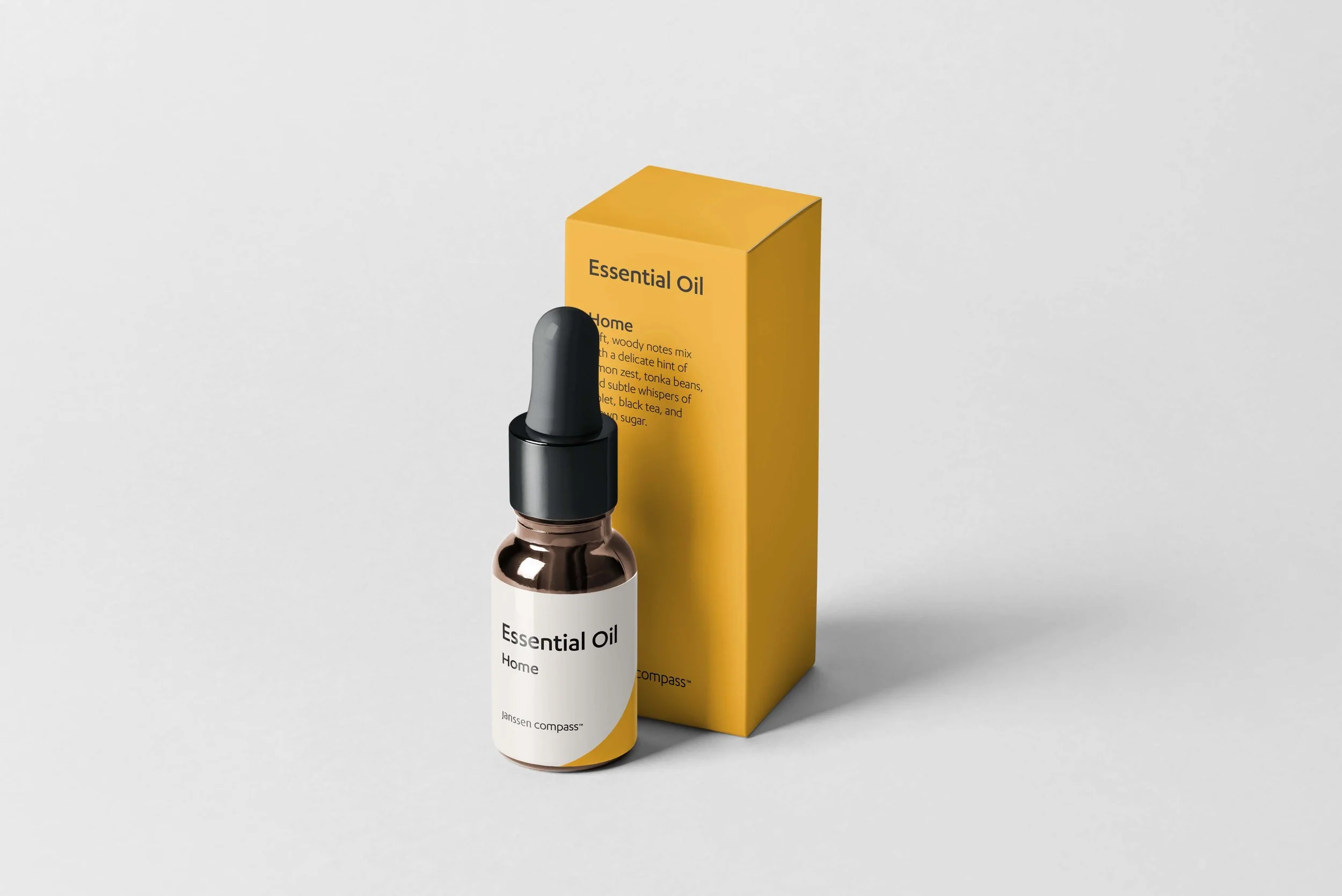
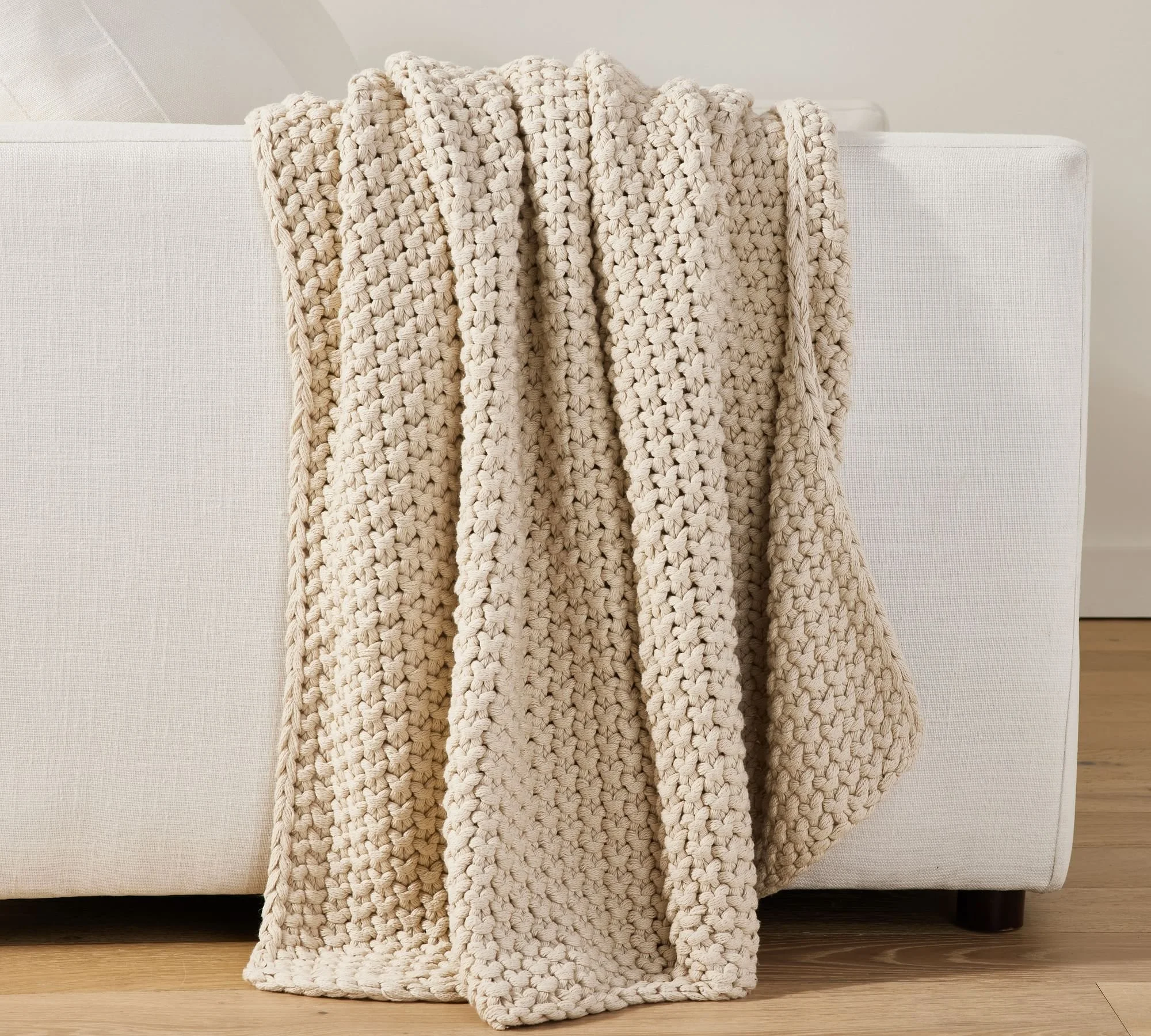
Sensorial welcome kit
I proposed items in welcome kits that engaged the senses, which engages patients emotionally and increases brand equity. Items include the tactile paper in the welcome letter and guidebook, the softness of a knit blanket, and the aromatherapy of essential oils.
Art direction
I art directed an illustrated animation for Janssen Compass. I created moodboards and provided critique and guidance.
Brand environment
Our team was asked to create a display for Janssen Compass at a National Oncology Meeting. I proposed creating a curated space that communicated program values through multi-sensory touchpoints. Guests would be invited to be participants in the brand rather than observers.


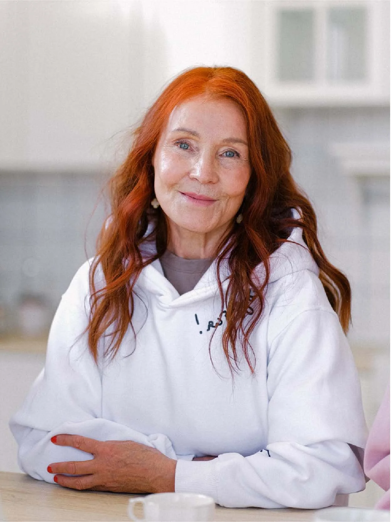
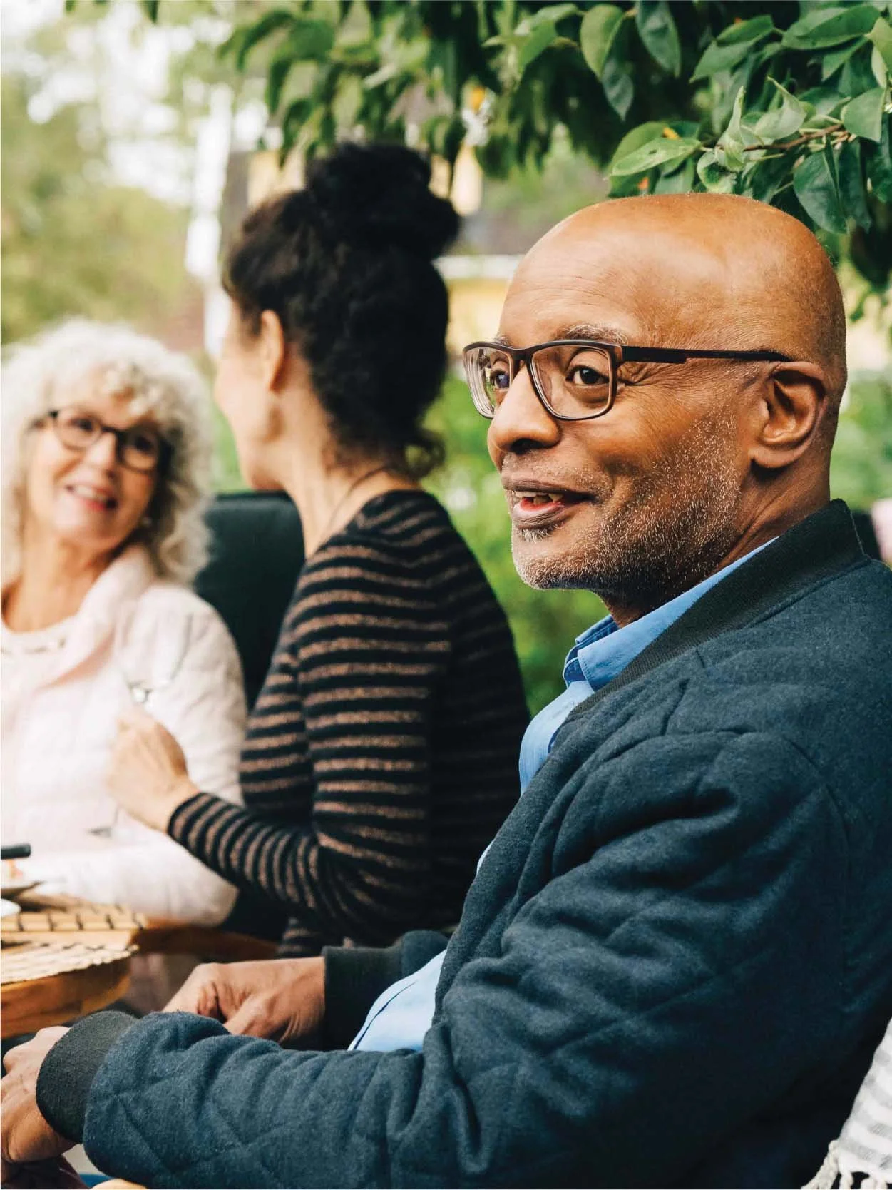
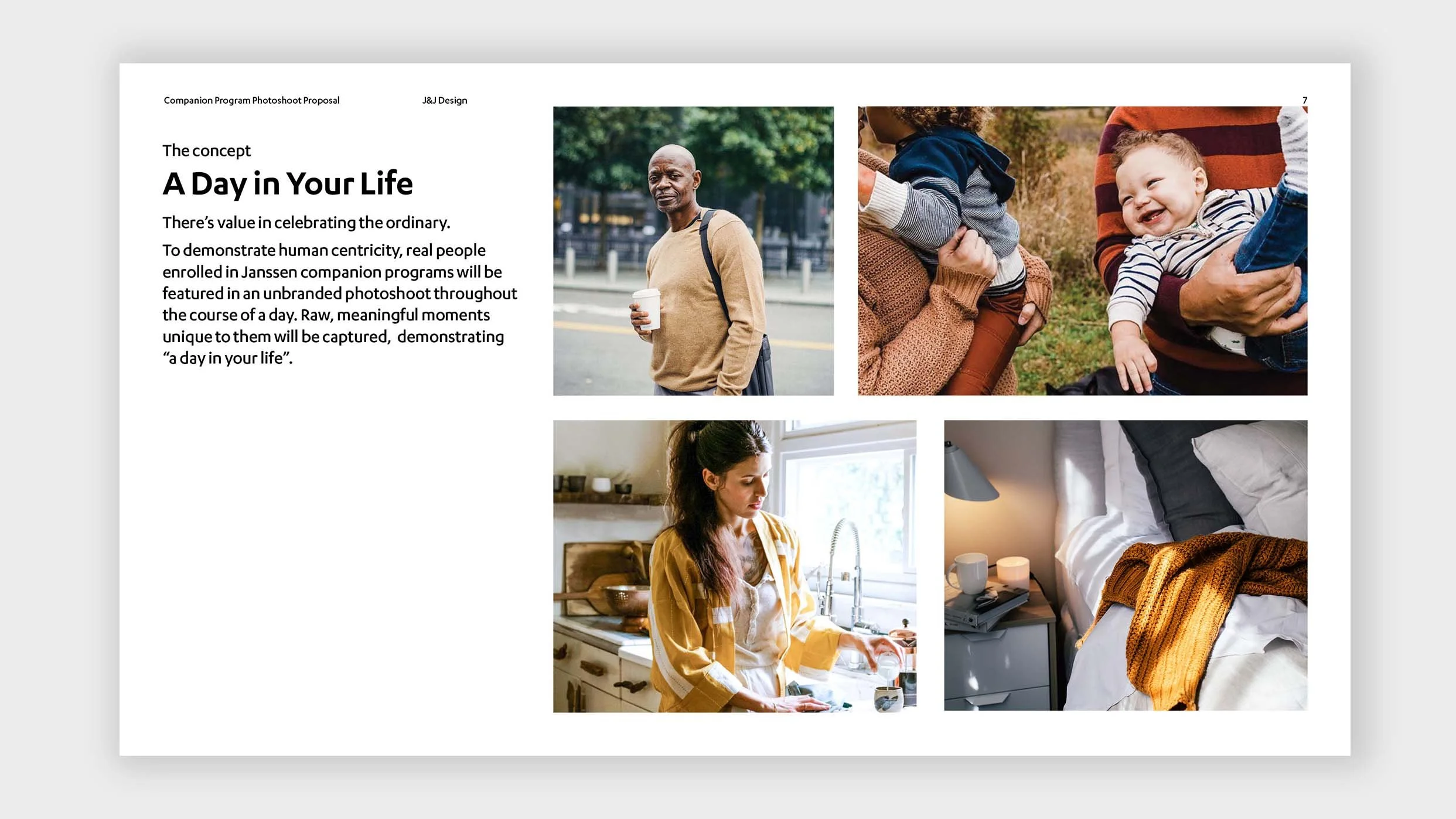
Patient-centered photo/videoshoot
I was limited to using stock photography for Janssen Compass due to an expedited launch schedule.
The stock photo landscape is saturated with inauthentic photos that lack diversity. I led the concept and proposal of a branded photo/videoshoot that would feature real Janssen Compass patients.
Digital ecosystem
Janssen Compass is brought to life digitally to ensure cohesive user experiences. Simplicity, highly contrasting visual hierarchy, and ease of use are top priorities.